React Native has limited StyleSheet + inline styles APIs. Don’t let that stop you from bringing your favorite utility classes over!
Why I love utility classes
As I continually delve deeper into frontend development, I have found the utility classes of Bootstrap and subsequently Tailwind to be incredibly effective and easy-to-use. I am going to outright say that it’s my new favorite way to style web apps, and I don’t see going back any time soon.
For me, the main benefits these utility class frameworks have over regular CSS is that everything is declarative, responsive, and self-explanatory. I’ve never been a fan of BEM which essentially make you rewrite your component hierarchy using CSS classes. I was most recently into using styled components and emotion so that the components encapsulated the CSS; however, on my most recent project I didn’t even bother installing them.
I think utility classes is practically a silver bullet. 90% of my daily CSS is aligning things along a grid, flexboxing things, adding predefined colors, and then making things mobile optimized & responsive. And the readability of these classes is self-explanatory: I never have to wonder, “what does hover:text-blue-400 or items-lg-center do?“. Coupled with TypeScript and a VS Code Tailwind Intellisense plugin, I no longer have to context switch out of my current place in the file while I’m developing. And that is a very good thing. [citation needed] 😄
Bringing them to React Native
Now, I have worked in React Native on-and-off since 2015. Secretly I have always kind of liked the fact that you have to use inline styles or the StyleSheet API since I don’t have to argue with anyone the merits of every different CSS system while trying to pick the “right” one.
But I really did start to miss my utility classes right away. It didn’t take many times of typing out:
{
  justifyContent: 'center',
  alignItems: 'center',
  flexDirection: 'row'  // b/c default is 'column' in React Native
}
for me to start to cringe and try to think of a better way. I started searching “Tailwind for React Native”, but I didn’t really find any package people were coalescing around, and there is no official package in the works to my knowledge.
But then it hit me: all I really needed to do was build some kind of API that takes strings and returns style objects. There’s a bunch of clever ways to do that, but I chose to keep it simple and brute-forcey. (I don’t think it really pays off to be super clever as an engineer, because then everyone else has to understand the cleverness to be able to work on your code. Better to be straightforward and clear, barring other major concerns!).
Simple Utility Class API
The Goal
There is no className in React Native, so we will have to figure out another API. The core of the API is going to be a function called util (you can rename this whatever you want, I just wanted something short since I’m using it everywhere) that you can use like so:
<Input style={util("px-1", "text-gray-600", isToggled && "font-bold")} />So it’s a function that:
- Can be applied to the native
styleprop of any component - Takes a comma-separated list of type-safe / Intellisense’d utility class names
- Also can filter out falsy values so we can conditionally apply classes, just like the classNames library.
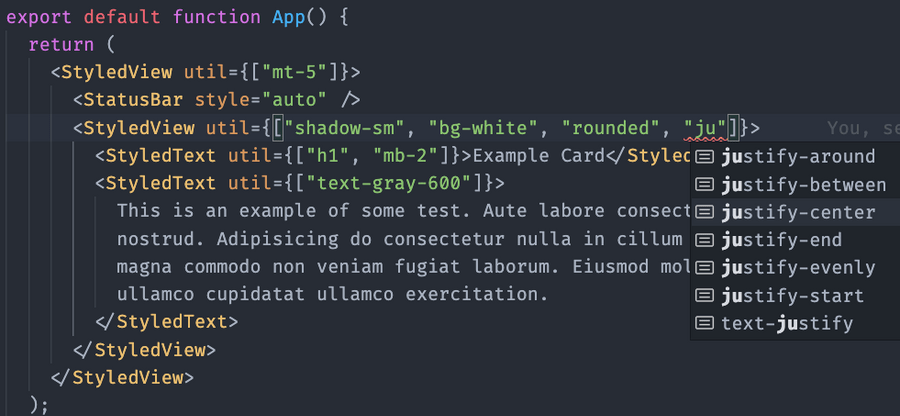
Additionally, if we get tired of importing util everywhere, we can definite customized components that are styled wrappers around native components. That way we can give things a util prop, which is nearly the same API as the util function, but it takes an array:
<StyledText util={["h1", "mb-2"]}>Example Card</StyledText>That way we end up with some excellent Intellisense like so:

Typing
Let’s start with some types (of course it’s all going to be TypeScript! 😀). This file is going to be called style_utility_helper.tsx:
type FlexUtils =
  | "flex-1"
  | "flex-col-reverse"
  | "flex-col"
  | "flex-grow-0"
  | "flex-grow"
  | "flex-no-wrap"
  | "flex-none"
  | "flex-row-reverse"
  | "flex-row"
  | "flex-shrink-0"
  | "flex-shrink"
  | "flex-wrap-reverse"
  | "flex-wrap"
  | "items-baseline"
  | "items-center"
  | "items-end"
  | "items-start"
  | "items-stretch"
  | "justify-around"
  | "justify-between"
  | "justify-center"
  | "justify-end"
  | "justify-evenly"
  | "justify-start"
  | "self-auto"
  | "self-center"
  | "self-end"
  | "self-start"
  | "self-stretch";
Those are all of the flexbox utilities we might want. Remember that React Native is flexbox-only, so these are super important / useful.
We’ll make a union type when we add the other utilities. For now let’s just do this:
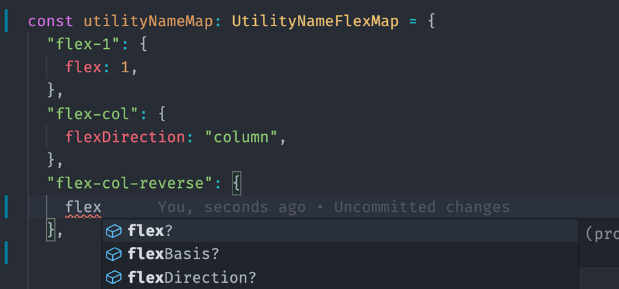
export type UtilityName = FlexUtils;Now our goal is to get type-safe Intellisense for the style objects. We can piggyback off of React Native’s types if we import { FlexStyle } from "react-native"; at the top, and then define our mapping type:
type UtilityNameFlexMap = {
  [key in UtilityName]: {
    [FlexKey in keyof FlexStyle]: FlexStyle[FlexKey];
  };
};
Now if we make an object literal and annotate it to be UtilityNameFlexMap, we can get type-safety when we’re doing our utility class style definitions!

Pure TypeScript Implementation
Once we have a typed object called utilityNameMap, we can implement our main function, which will accept an array of utilities an return a single style object:
style_utility_helper.ts
/**
 * A helper that converts an array of utility class names -> inline styles.
 * @param utilities - An array of utility class names or falsy vals.
 */
export function applyStyleUtilities<
  T extends FlexStyle | TextStyle | ViewStyle // imported from React Native
>(utilities: Util): T {
  return utilities?.filter(isTruthy).reduce((accumulator, utility) => {
    return { ...accumulator, ...utilityNameMap[utility as UtilityName] };
  }, {}) as T;
}
Note this function takes an array, which is straightforward. We can now add an additional function that wraps this one but takes a list of arguments rather than an array:
/**
 * A helper that converts a list of utility class names into inline styles.
 * @param utilities - A comma-separated list of utility class names
 */
export function util<T extends FlexStyle | TextStyle | ViewStyle>(
  ...utilities: Array<UtilityName | Spacer | Falsy>
): T {
  return applyStyleUtilities(utilities);
This completes the implementation of util, so we can add it to style props anywhere now!
Here is also a test file that we can run to verify that our utility helper is properly working:
style_utility_helper.test.ts
import { TextStyle, ViewStyle } from "react-native";
import { applyStyleUtilities } from "src/helpers/style_utility_helper";

describe("StyleUtilityHelper", () => {
  describe("applyStyleUtilities", () => {
    it("translates tailwind utilities correctly", () => {
      expect(
        applyStyleUtilities([
          "bg-primary",
          "border",
          "border-gray-200",
          "rounded",
          "p-5",
        ])
      ).toEqual({
        backgroundColor: expect.any(String),
        borderWidth: 1,
        borderColor: expect.any(String),
        borderRadius: expect.any(Number),
        padding: expect.any(Number),
      } as ViewStyle);

      expect(
        applyStyleUtilities(["italic", "font-bold", "text-lg", "mb-3"])
      ).toEqual({
        fontStyle: "italic",
        fontWeight: "bold",
        fontSize: expect.any(Number),
        marginBottom: expect.any(Number),
      } as TextStyle);
    });
  });
});
React Component Implementation
And then to make our custom component wrappers:
src/components/atoms/styled_view.tsx
import React from "react";
import { View, ViewProps, ViewStyle } from "react-native";
import {
  applyStyleUtilities,
  UtilProp,
} from "src/helpers/style_utility_helper";

export type StyledViewProps = ViewProps & UtilProp;

export const StyledView: React.FC<StyledViewProps> = ({
  style,
  util,
  ...props
}) => {
  const stylesWithUtilities = Object.assign(
    {},
    style,
    applyStyleUtilities(util)
  );
  return <View {...props} style={stylesWithUtilities} />;
};
src/components/atoms/styled_text.tsx
import React from "react";
import { Text, TextProps, TextStyle } from "react-native";
import {
  applyStyleUtilities,
  UtilProp,
} from "src/helpers/style_utility_helper";

export type StyledTextProps = TextProps & UtilProp;

export const StyledText: React.FC<StyledTextProps> = ({
  style,
  util,
  ...props
}) => {
  const stylesWithUtilities = Object.assign(
    {},
    style,
    applyStyleUtilities(util)
  );
  return <Text {...props} style={stylesWithUtilities} />;
};
Usage
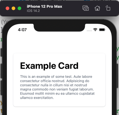
Finally when we put it all together we get a very flexible declarative API like so:
App.tsx
export default function App() {
  return (
    <StyledView util={["mt-5"]}>
      <StatusBar style="auto" />
      <StyledView
        util={[
          "shadow-sm",
          "bg-white",
          "rounded",
          "justify-center",
          "mx-3",
          "my-3",
          "p-3",
        ]}
      >
        <StyledText util={["h1", "mb-2"]}>Example Card</StyledText>
        <StyledText util={["text-gray-600"]}>
          This is an example of some test. Aute labore consectetur officia
          nostrud. Adipisicing do consectetur nulla in cillum nisi et nostrud
          magna commodo non veniam fugiat laborum. Eiusmod mollit minim eu ea
          ullamco cupidatat ullamco exercitation.
        </StyledText>
      </StyledView>
    </StyledView>
  );
}
Which then yields:

Wrapping Up & Futher Study
Hope you find this useful! Here’s my github repo with all of the code working in an example Expo app.
Some things I didn’t cover in this blog post but are part of the repo:
- I used a library called react-native-responsive-screen to implement a
spacer_utility_helperwhich specifically managespx-5andmb-1, etc. These are margin and padding helpers which are responsive per screen size and some of my favorite / most frequently used utility classes - Take a look at the
theme.tsfile in the repo. It’s basically akin to a Tailwind config file, but vastly simplified. In my real life apps, I also define font families to use in that file.
I briefly considered making this an npm library, but felt like it would be too much work to abstract everything for general use. 😅 I deliberately omitted a bunch of styles that either didn’t apply on the React Native / mobile platform or that I just didn’t really think I would need. I also left out a bunch of colors and the ability to customize all of the colors. That said, somebody feel free to make a library out of this or use it however you want! 🚀